GE Healthcare • 2018 - 2025
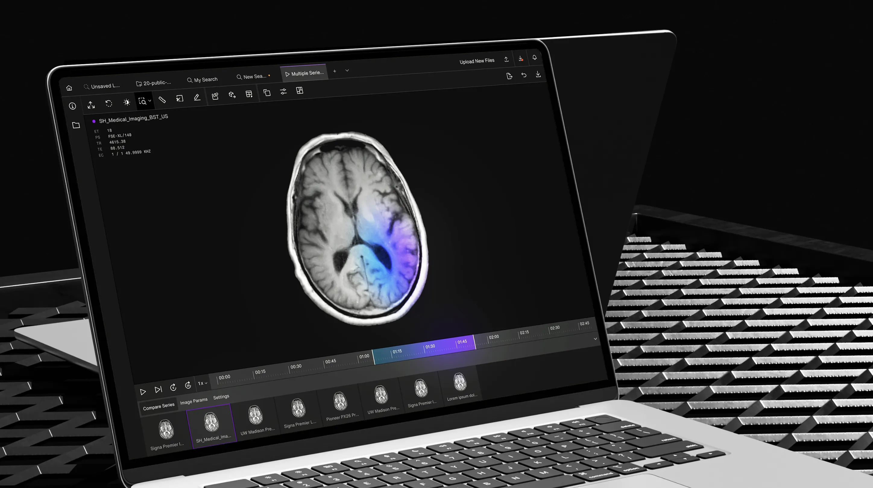
Rationalizing a complex medical-imaging platform into a clearer, scalable, and more maintainable product experience.
Overview
Sherlock is a complex GE Healthcare platform used to manage and explore large volumes of medical-imaging data across teams, exams, series, workstations, collections, searches, and user permissions. I first led the UX/UI design of the platform in 2018, producing the original experience for a fast-moving MVP. Several years later, after the product had grown through new features and inconsistent implementation, I was brought back to audit, rationalize, and redesign large parts of the interface.
The 2022 work focused on restoring coherence: identifying UX and UI issues, prioritizing fixes, advising on product direction, redesigning key sections, and rebuilding the design system in Figma so the front-end team could implement and maintain the platform more reliably. The project remained complex and difficult to steer organizationally, but the audit, redesign, and design system created a stronger foundation for Sherlock’s evolution — moving it from a powerful internal tool toward a more scalable product experience.
Role
UX/UI Lead, Product Design Lead, Design System Lead, Product Audit & Advisory
Disciplines
Product Audit, Functional Assessment, Design System, Figma Component System, Product Strategy, Information Architecture, Search Experience, Data Management UI, Dashboard Design, Developer Handoff, Enterprise Software
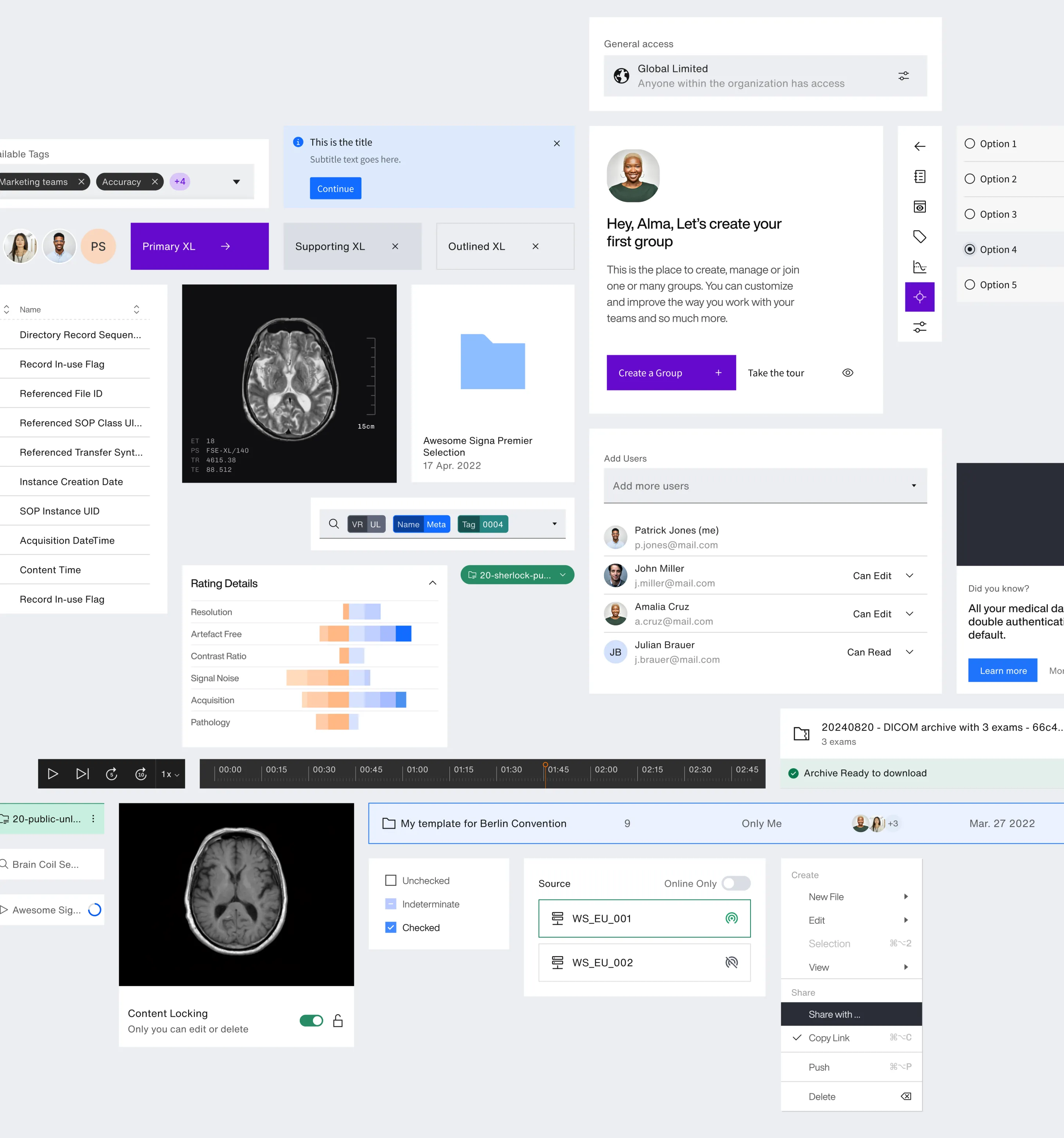
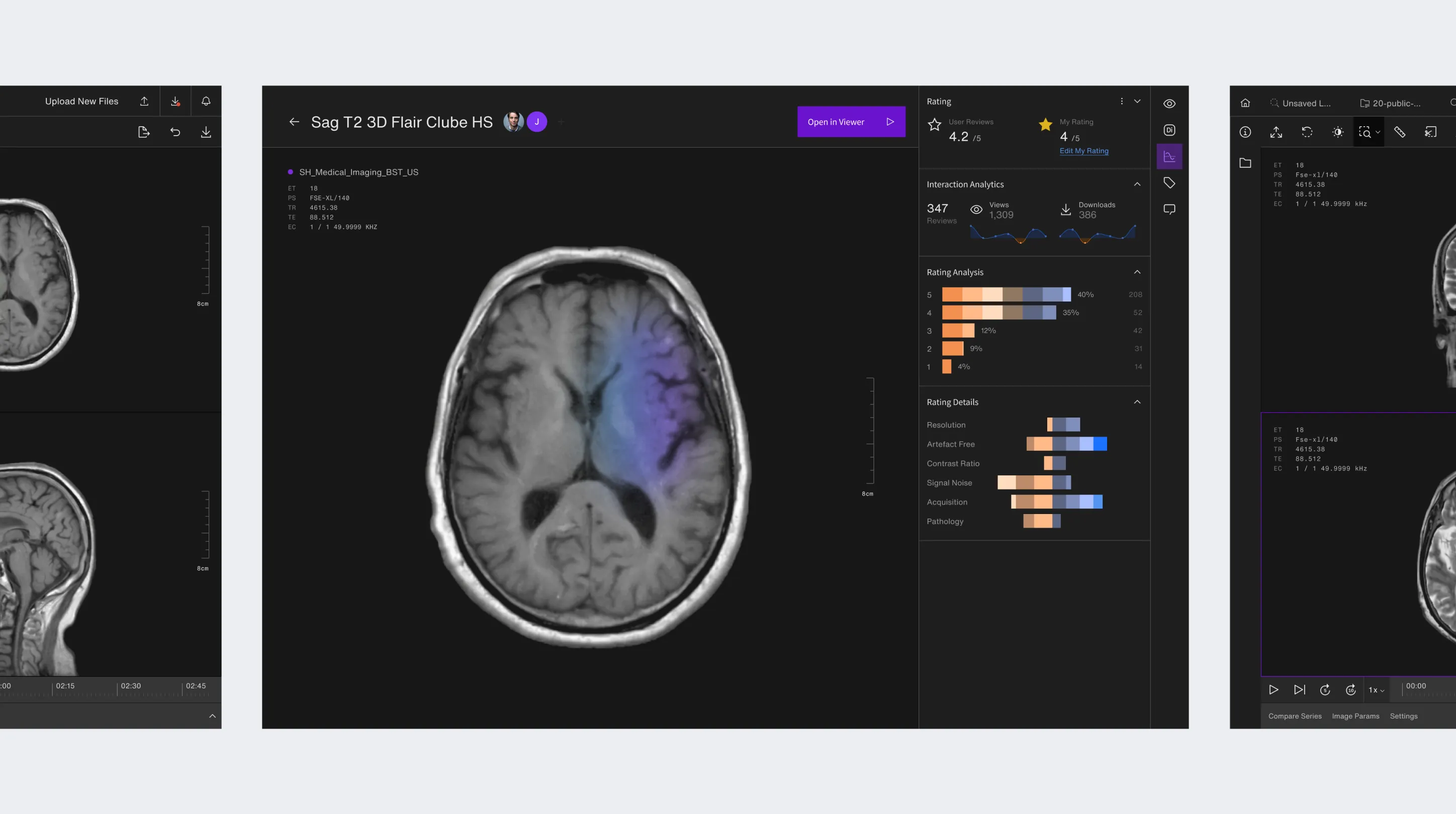

The audit mapped UX, UI, development, and strategic issues across the platform, turning accumulated product debt into prioritized batches of action.
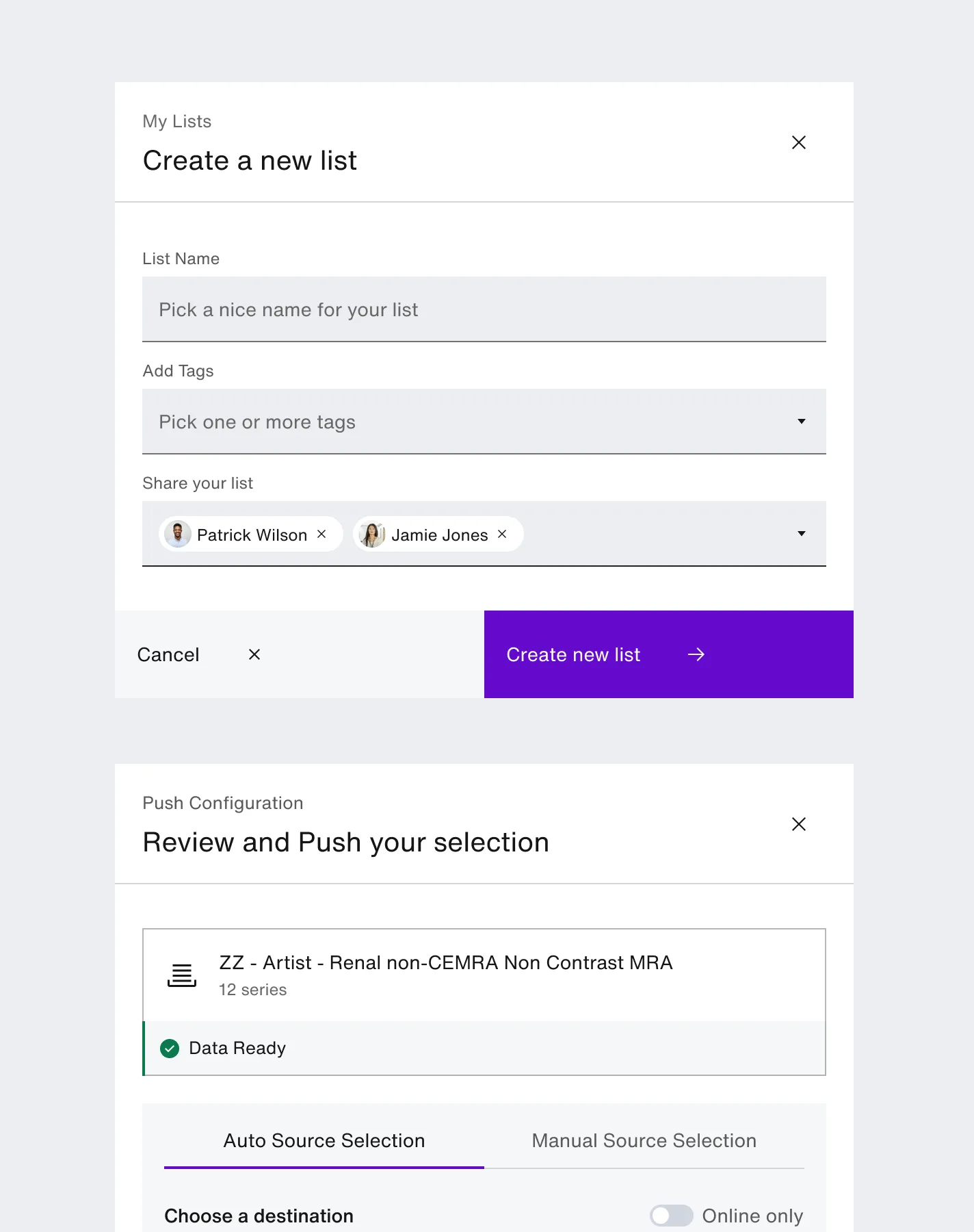
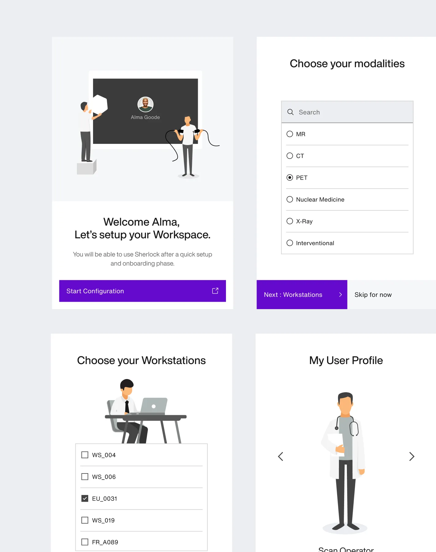
The strategic shift was simple: Sherlock had become a powerful tool for expert users, but needed to evolve into a product people could understand, trust, and enjoy using.
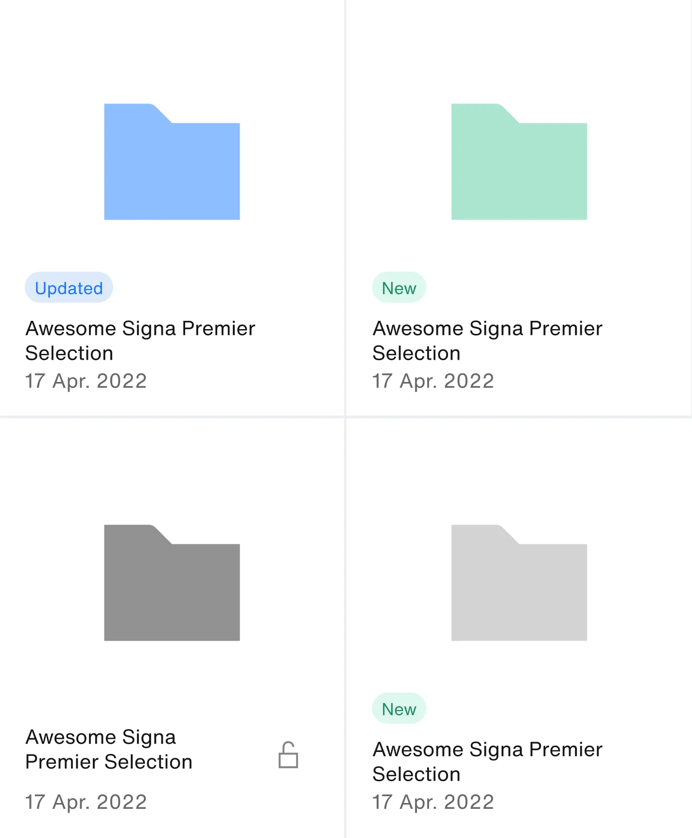
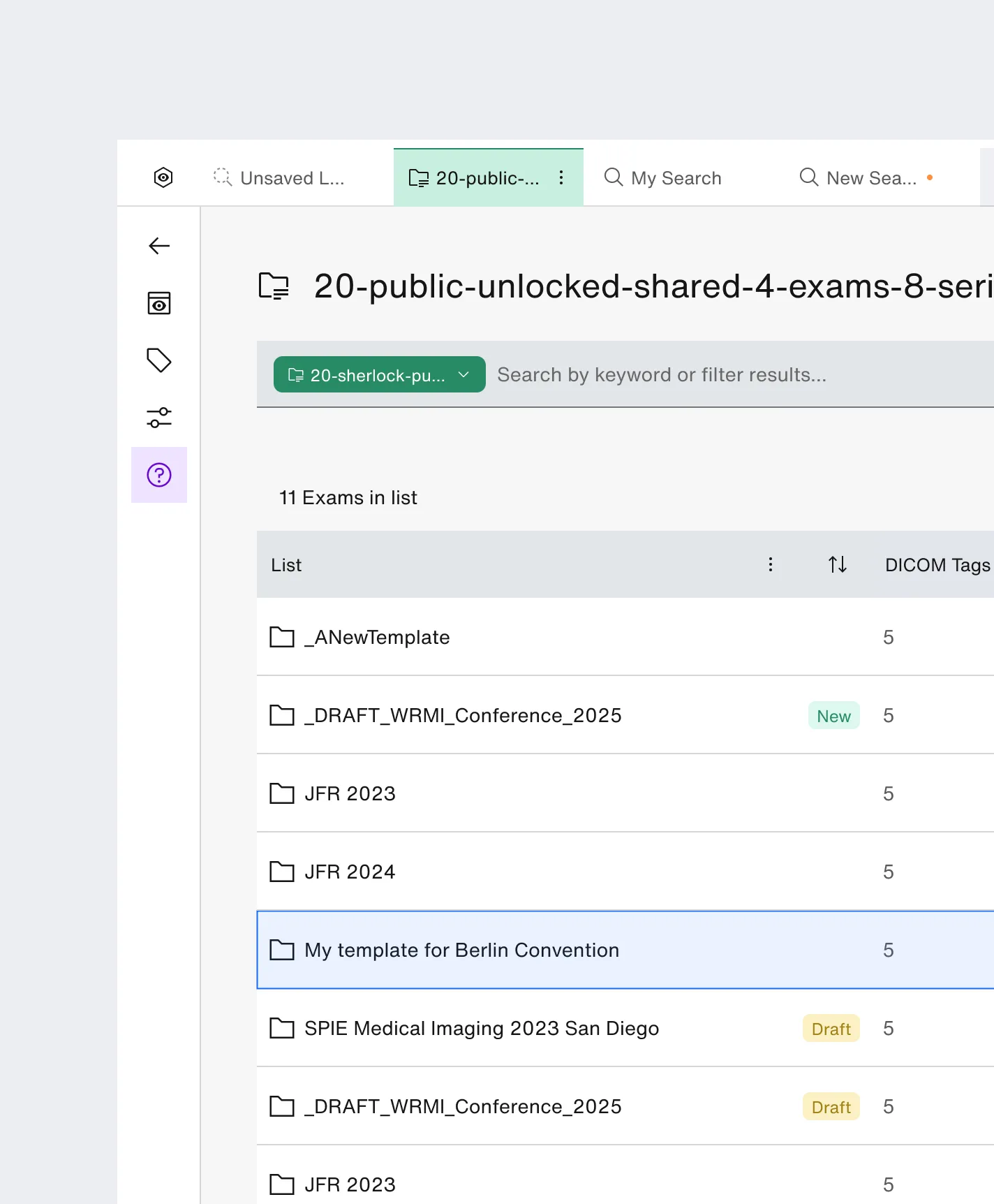
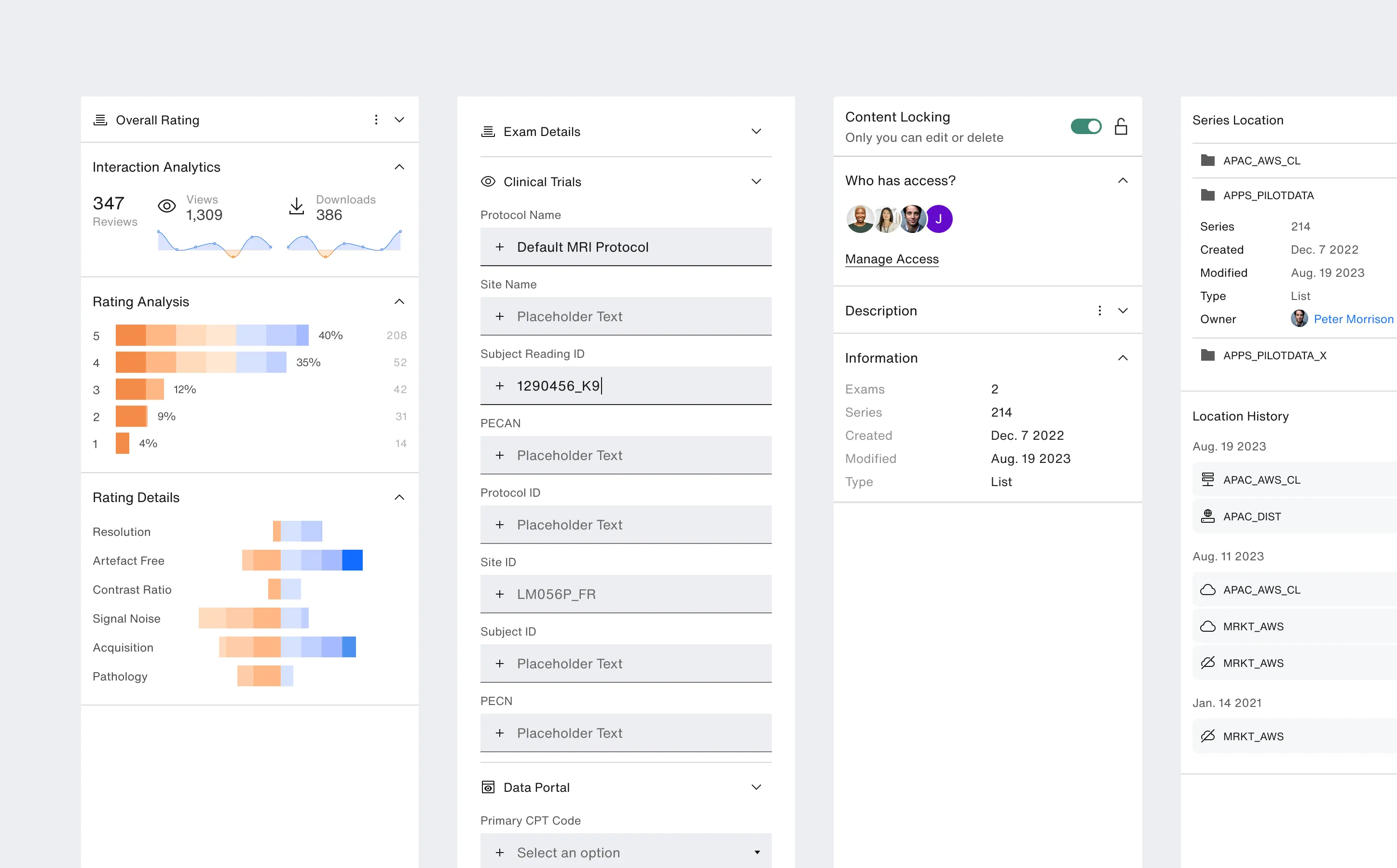
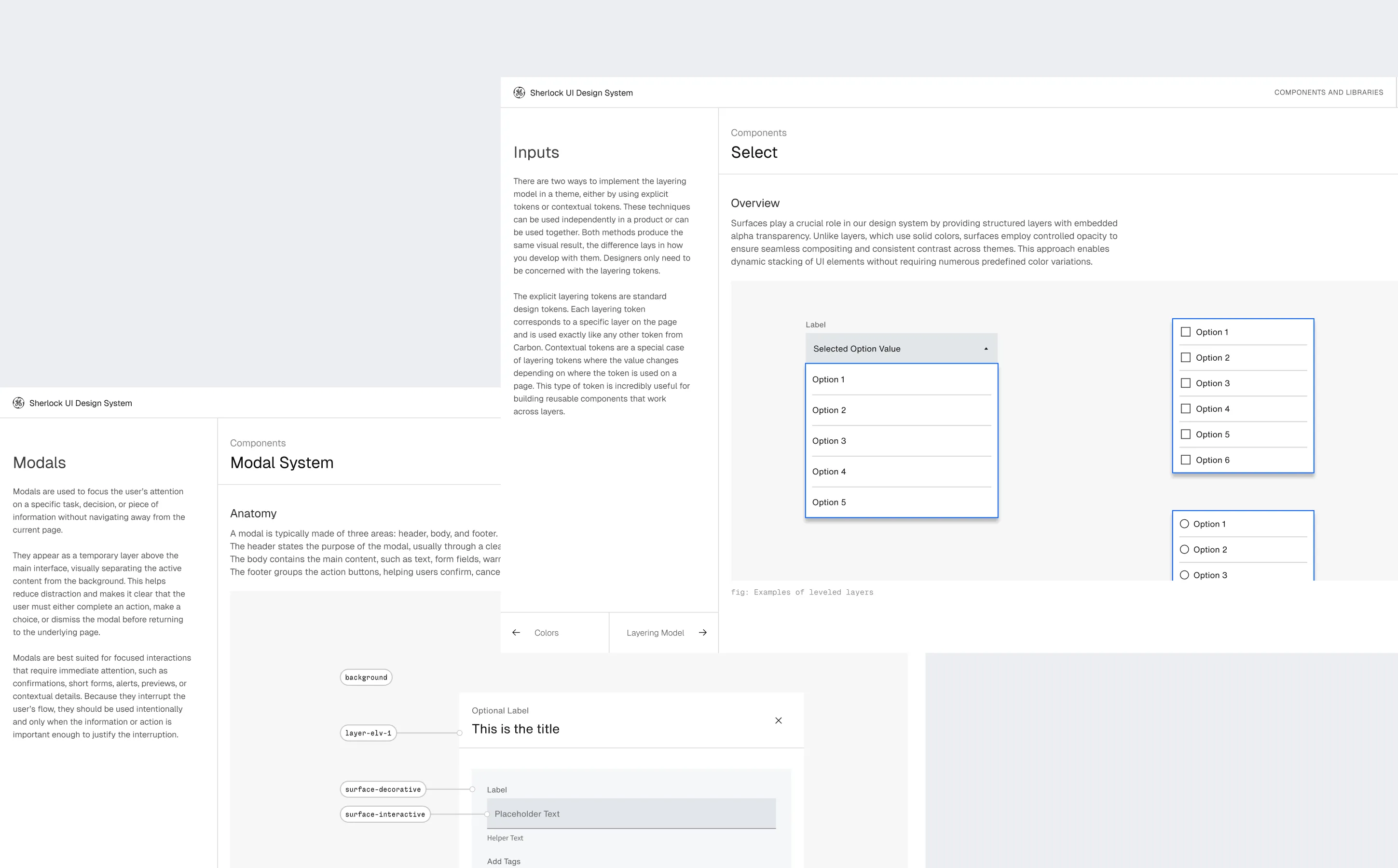
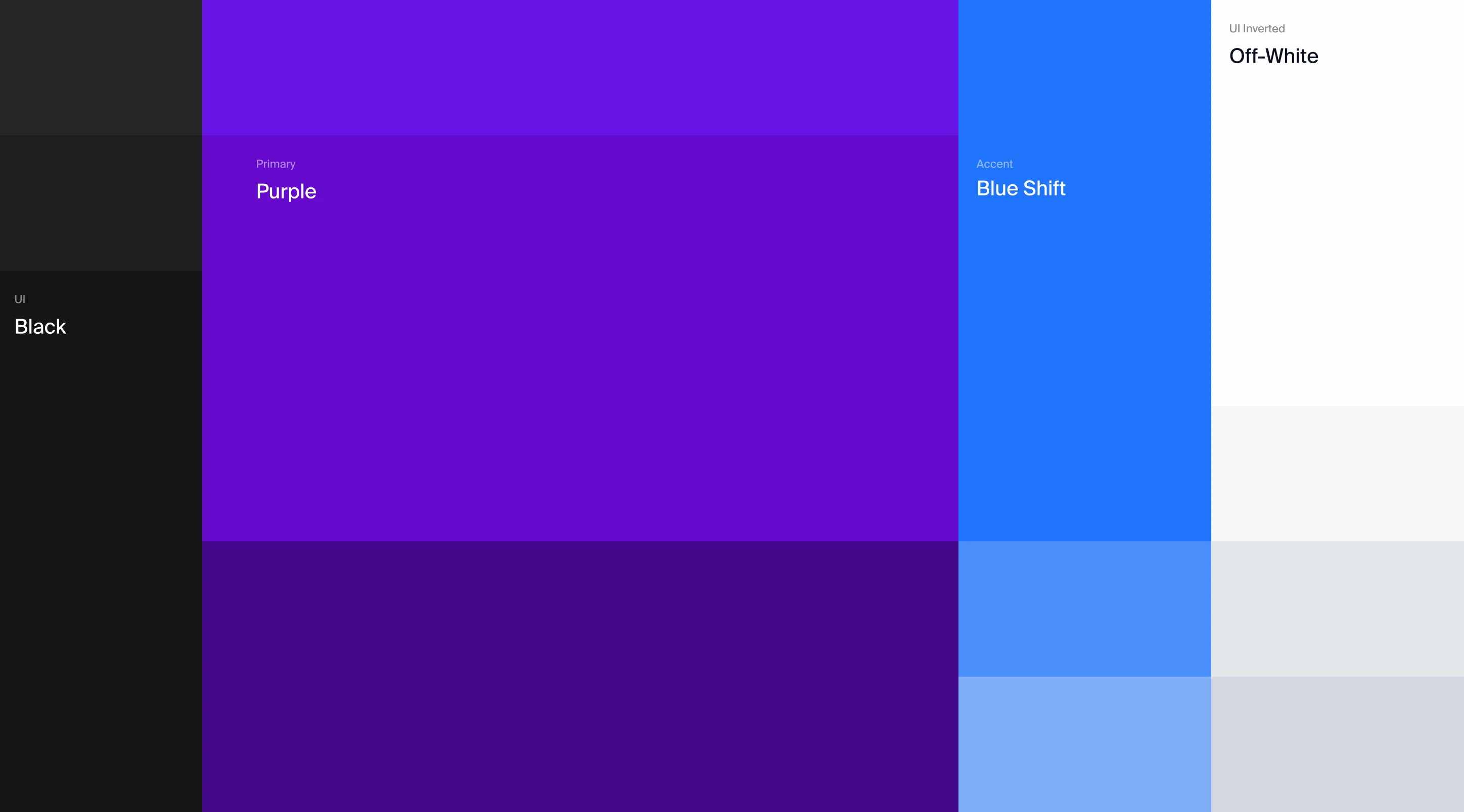
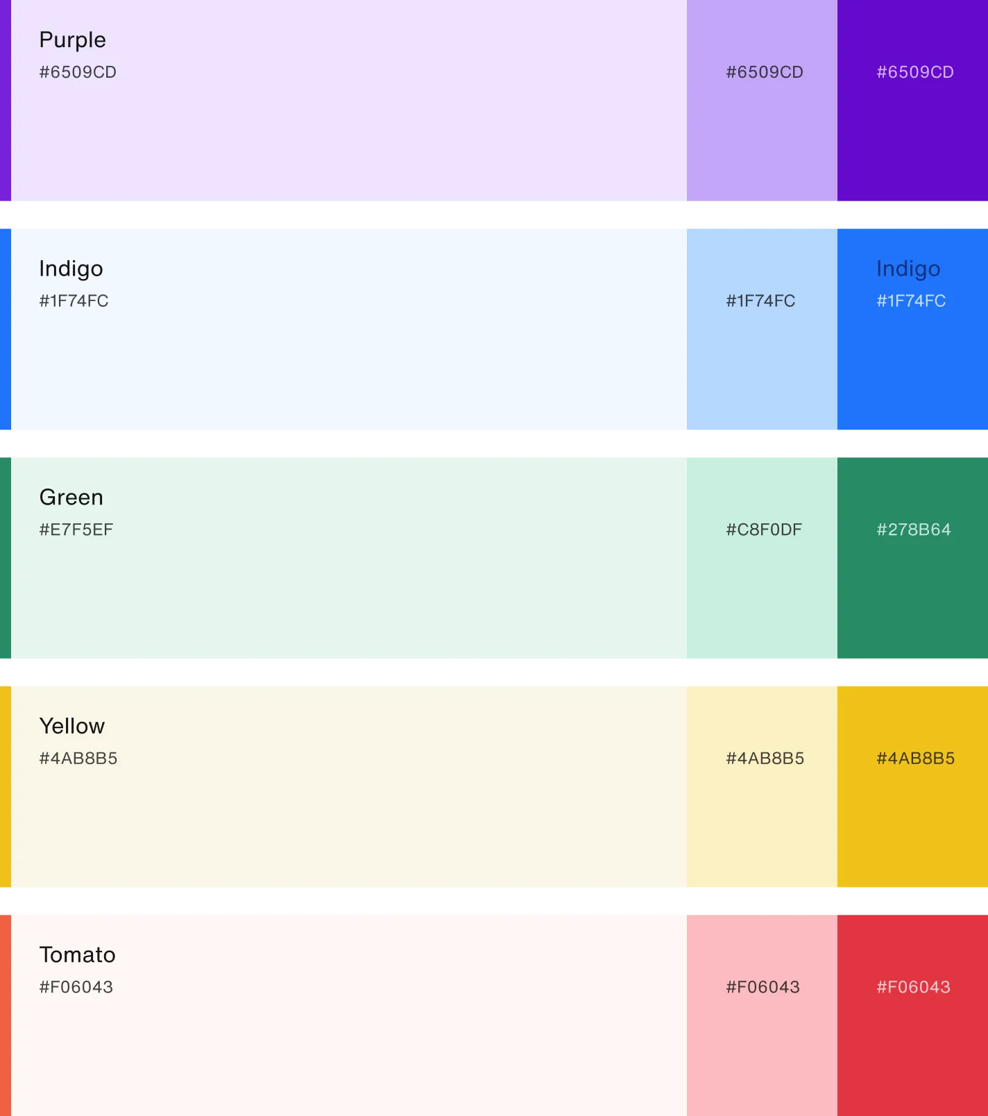
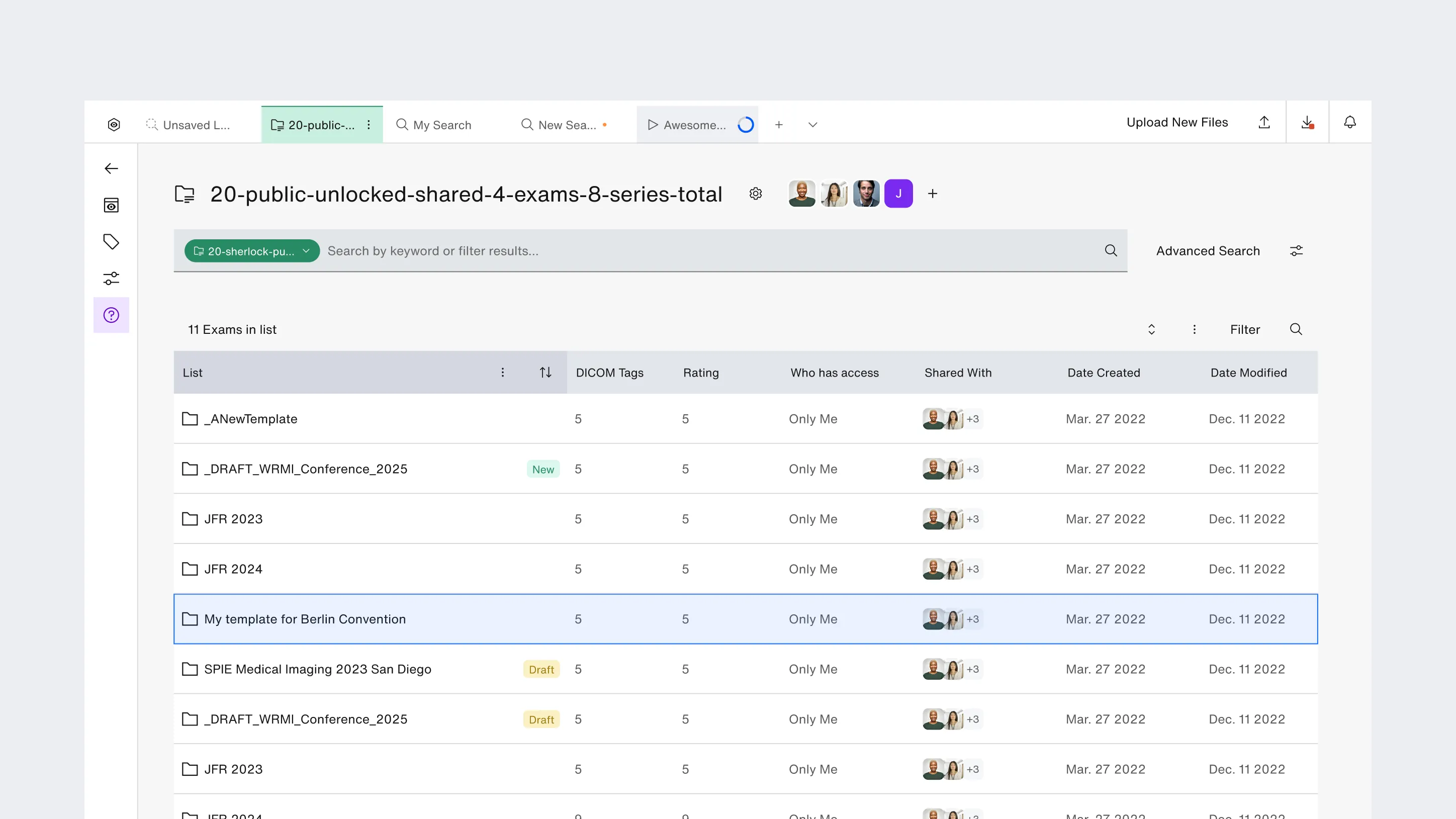
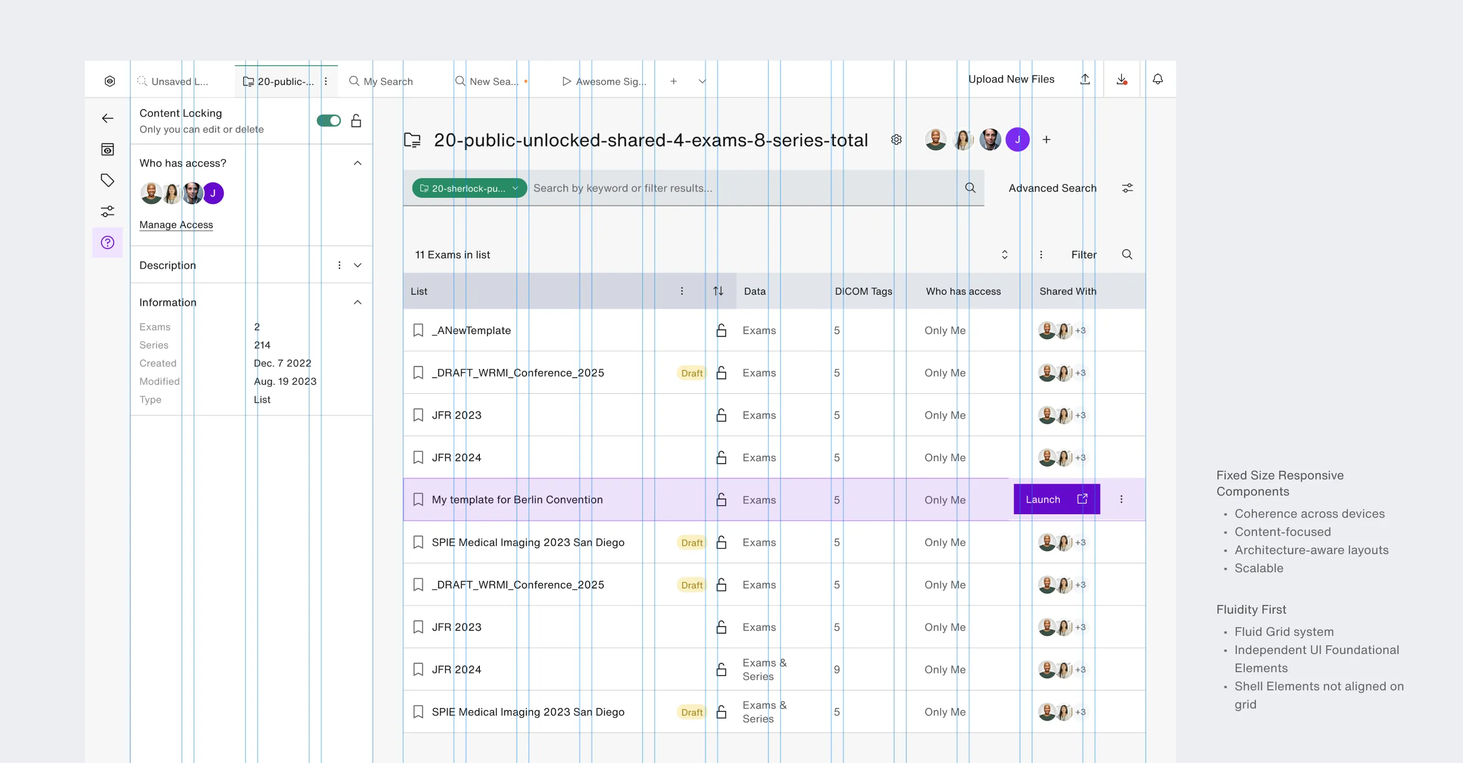
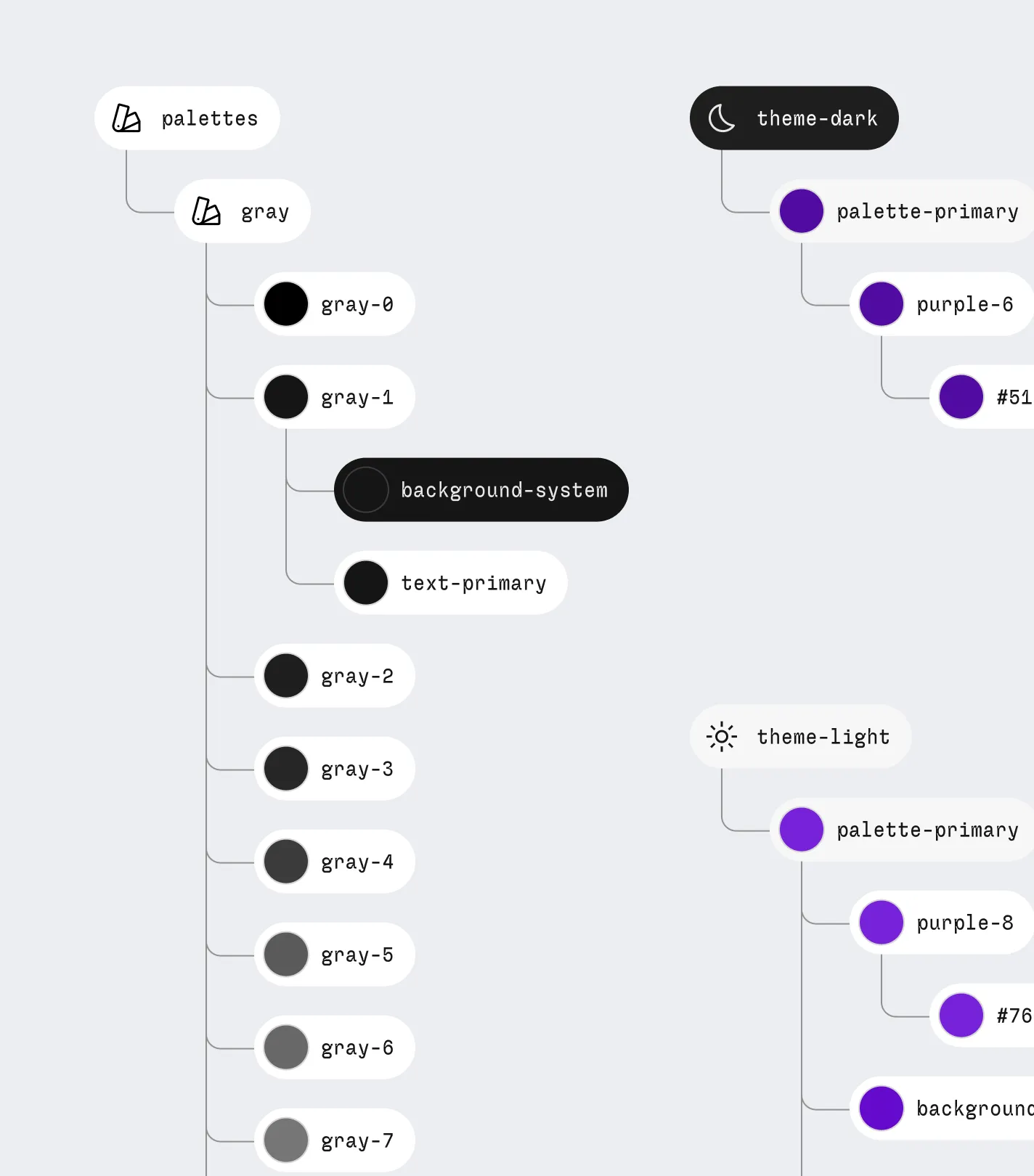
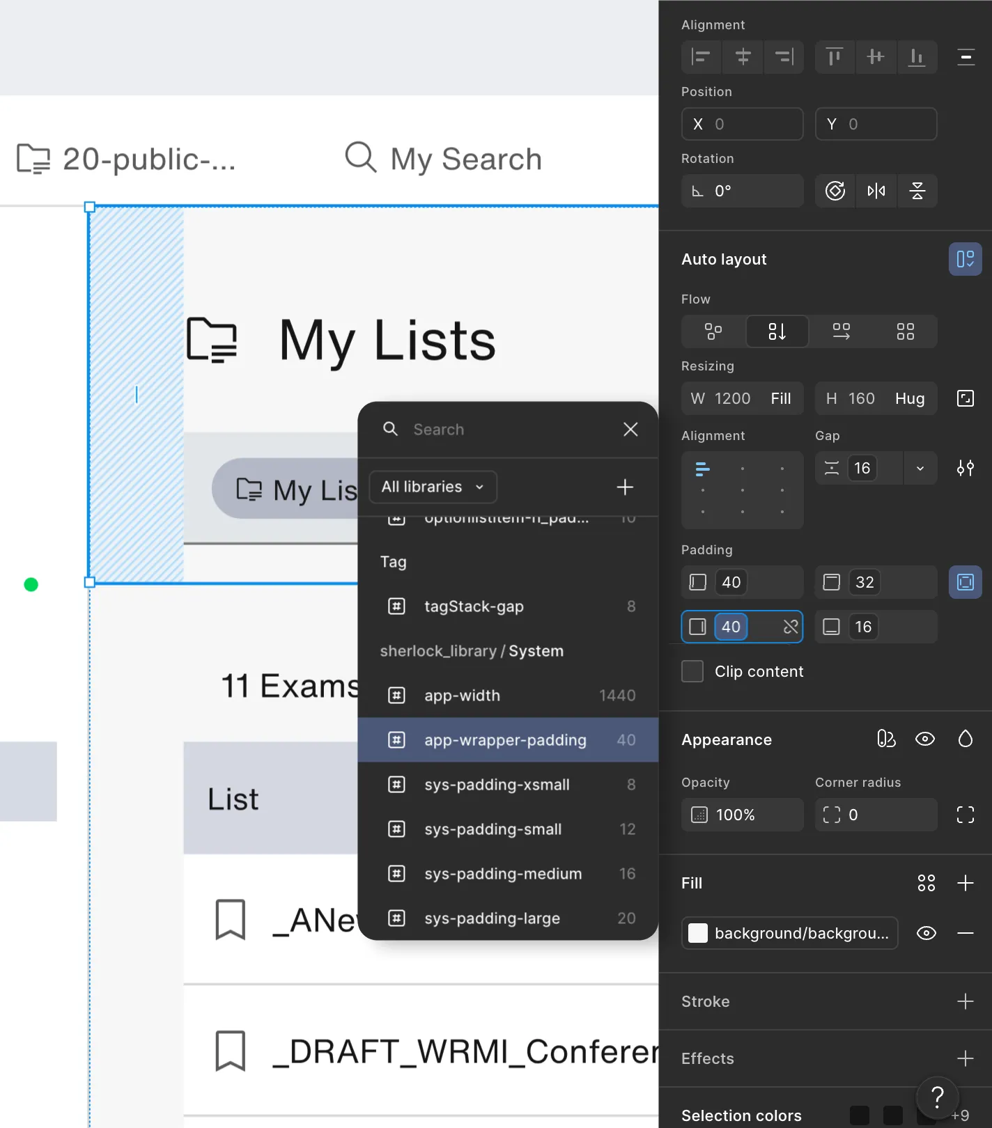
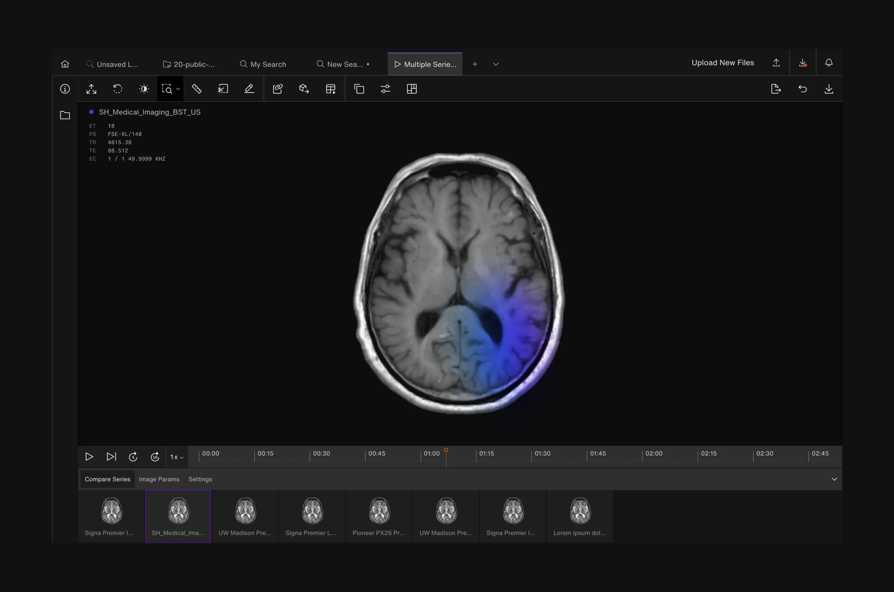
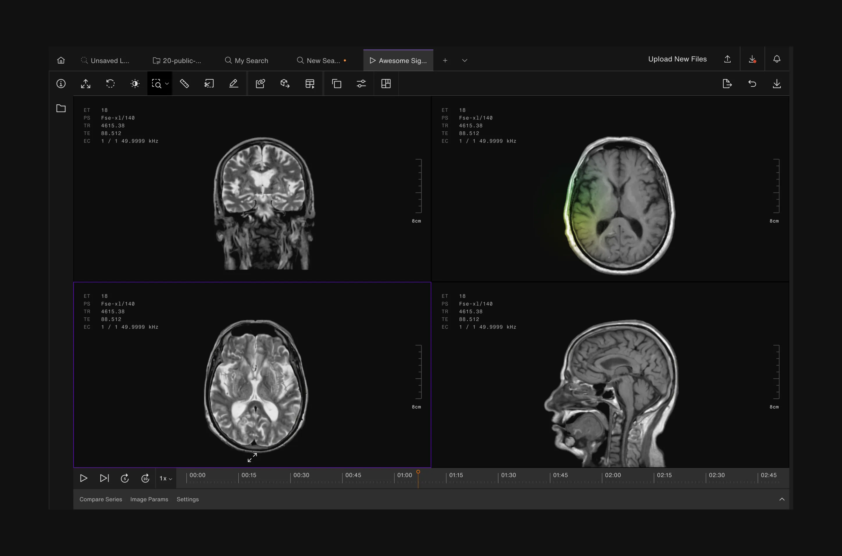
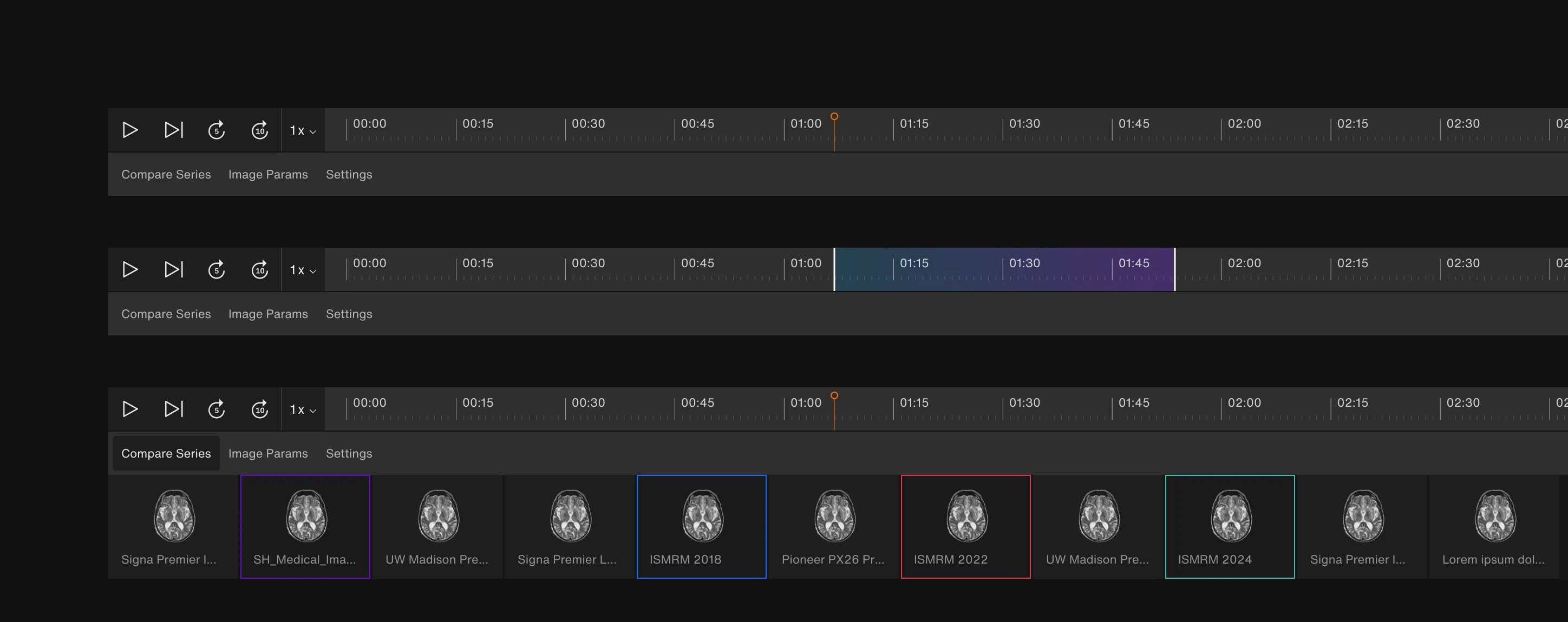
The Figma design system rebuilt the bridge between design and code, giving the front-end team reusable components, shared logic, and a clearer foundation for future features.
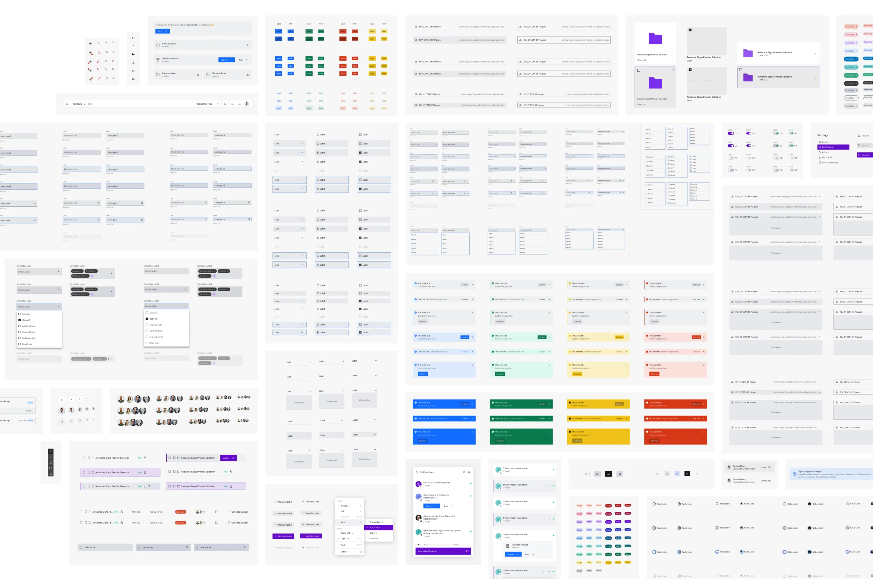
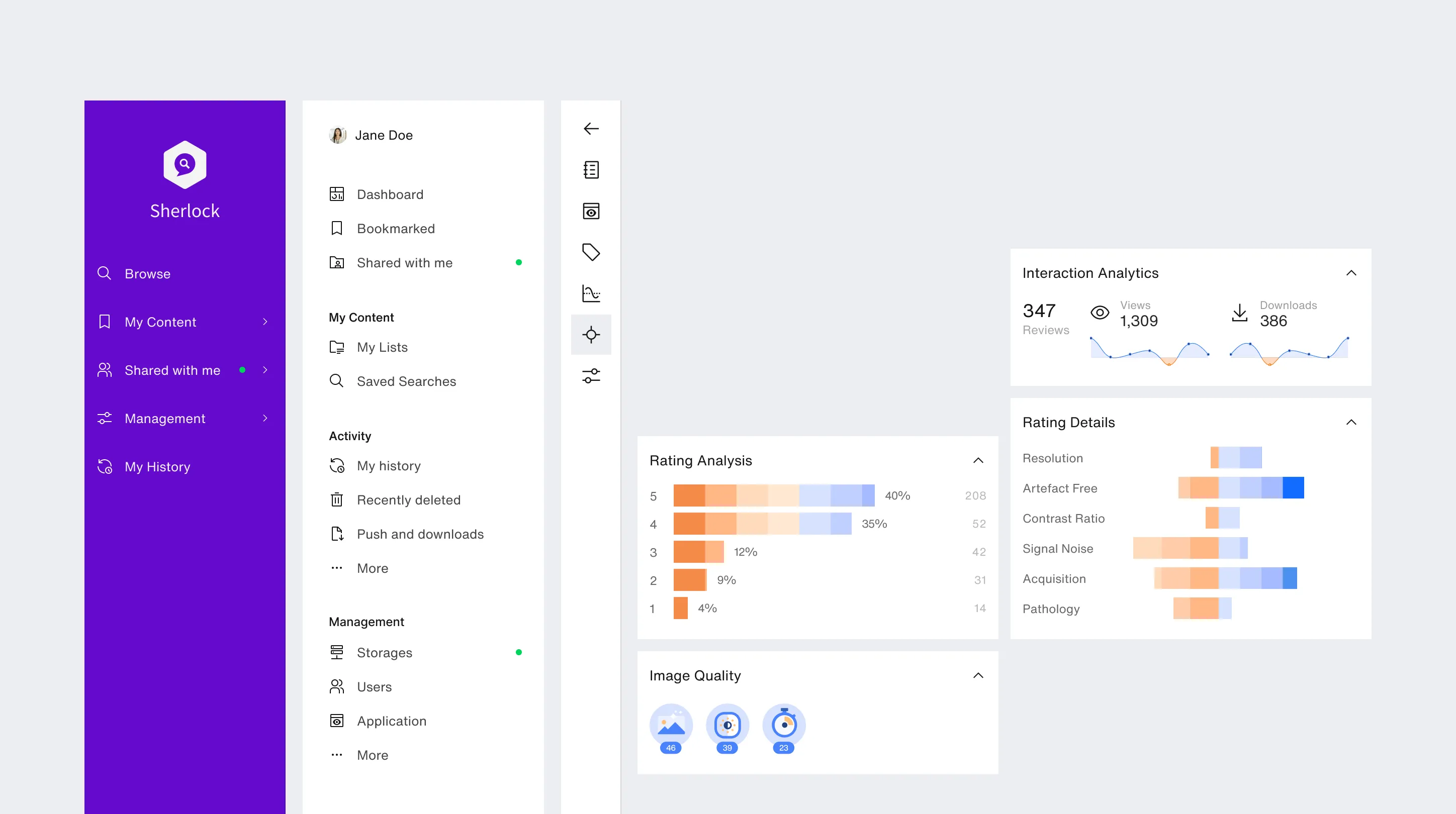
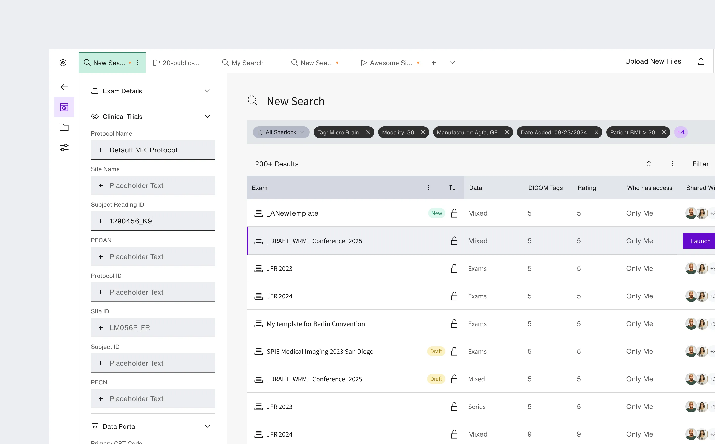
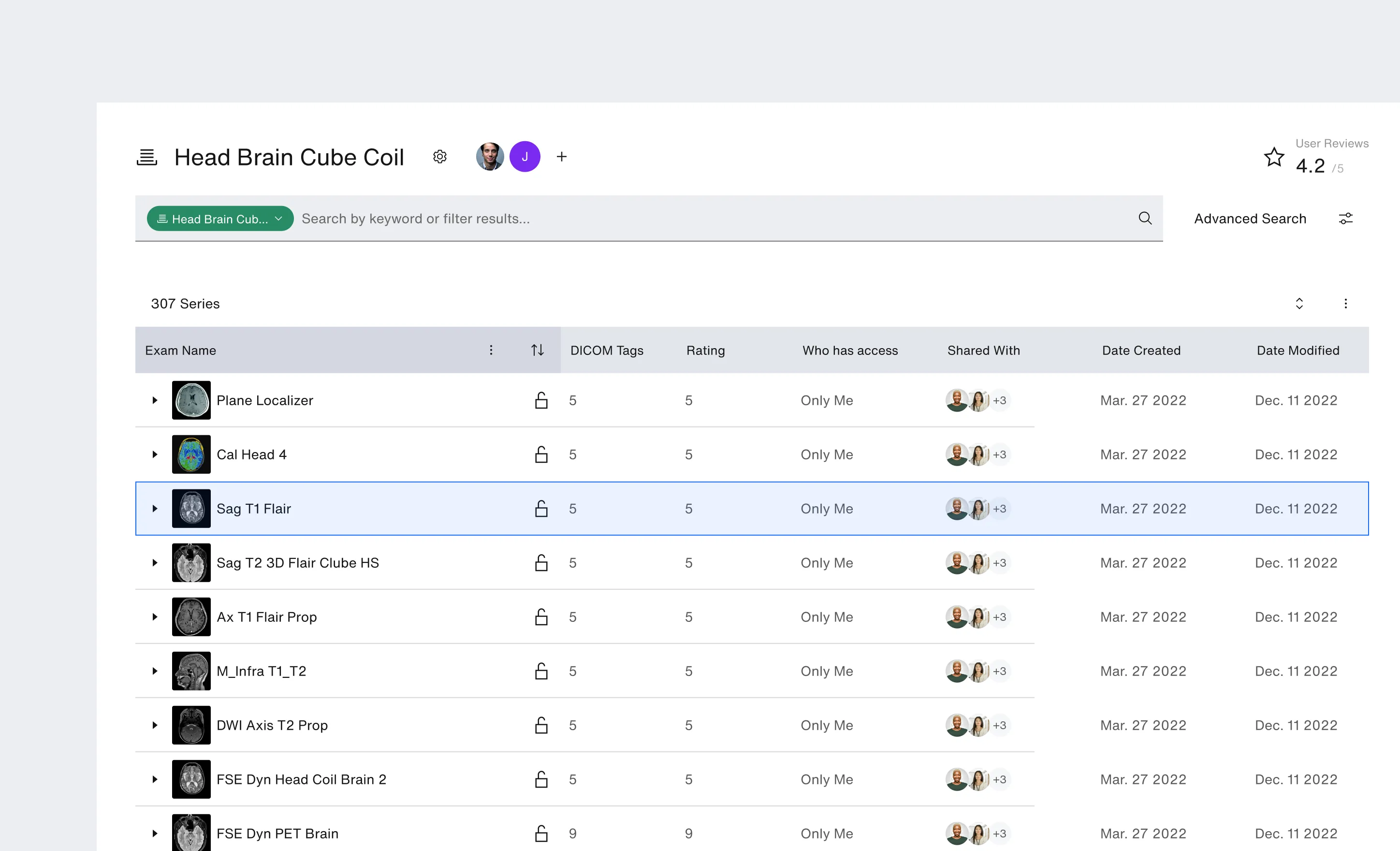
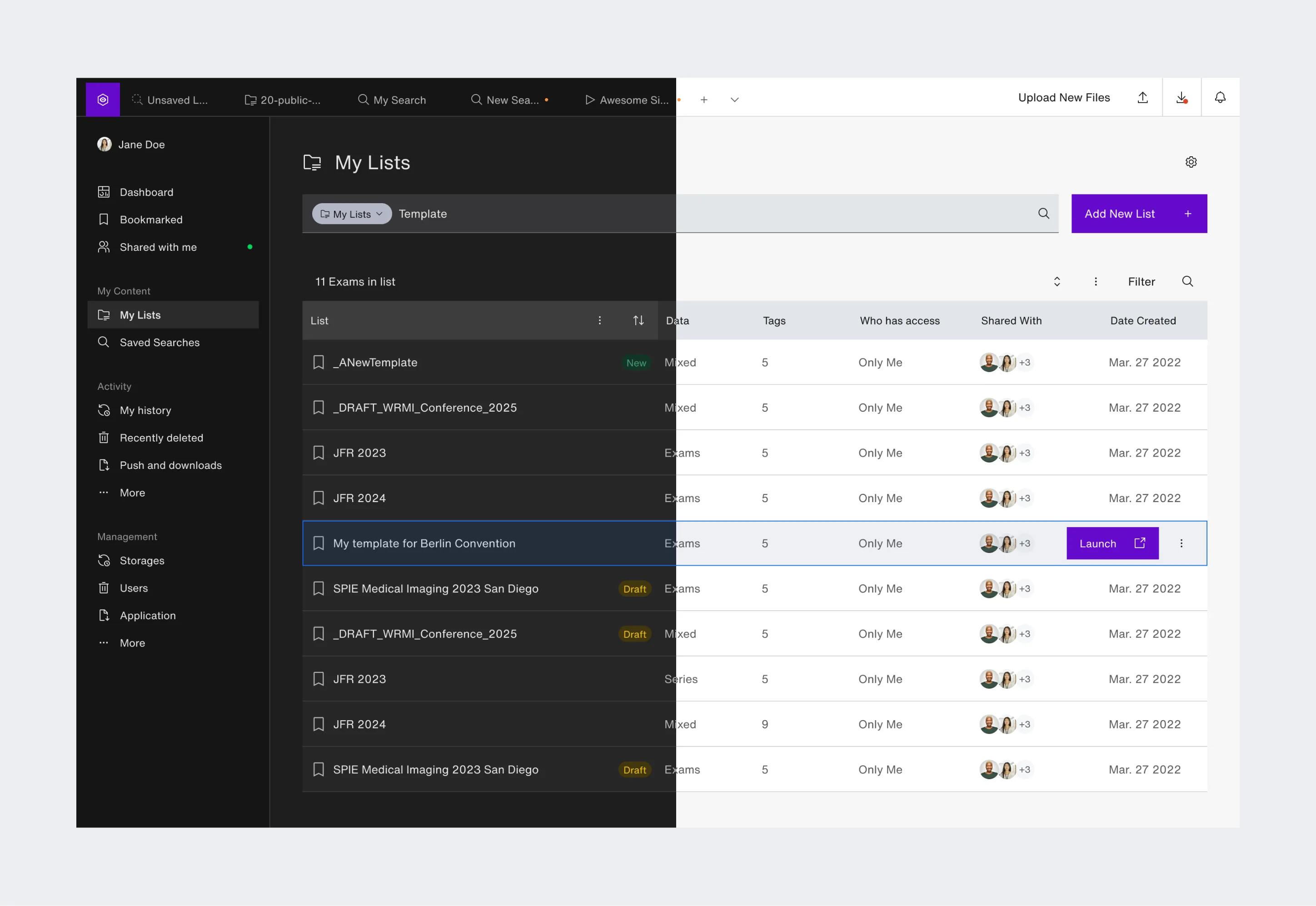
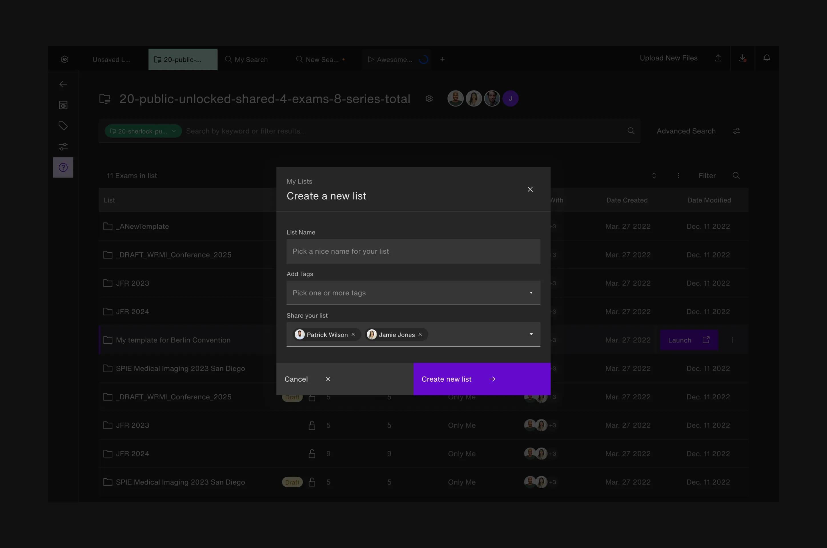
Light and dark themes were treated as core system behaviours, not visual variants — ensuring Sherlock could move between data management, workspace navigation, and dark medical-imaging viewers without breaking coherence.
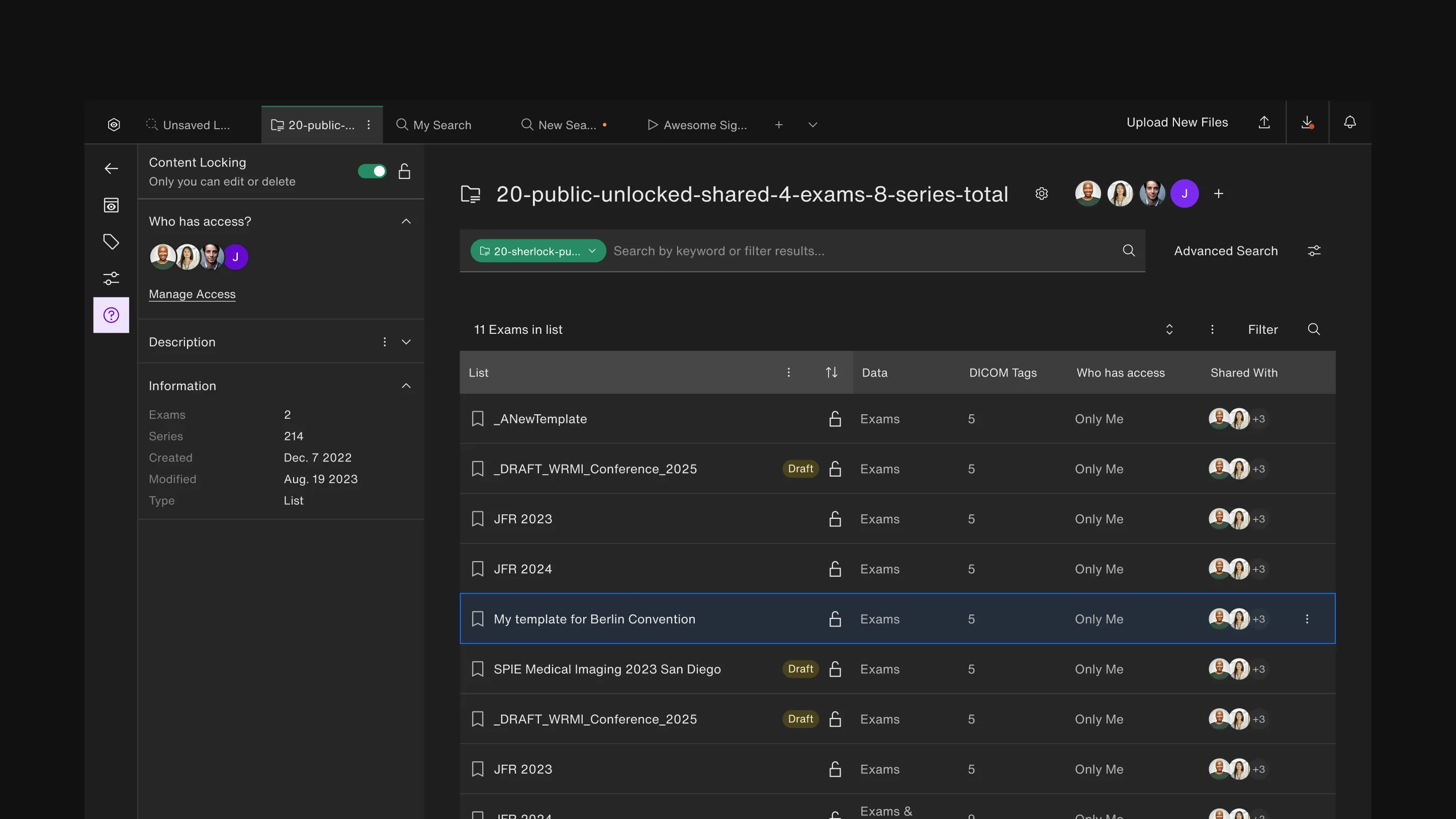
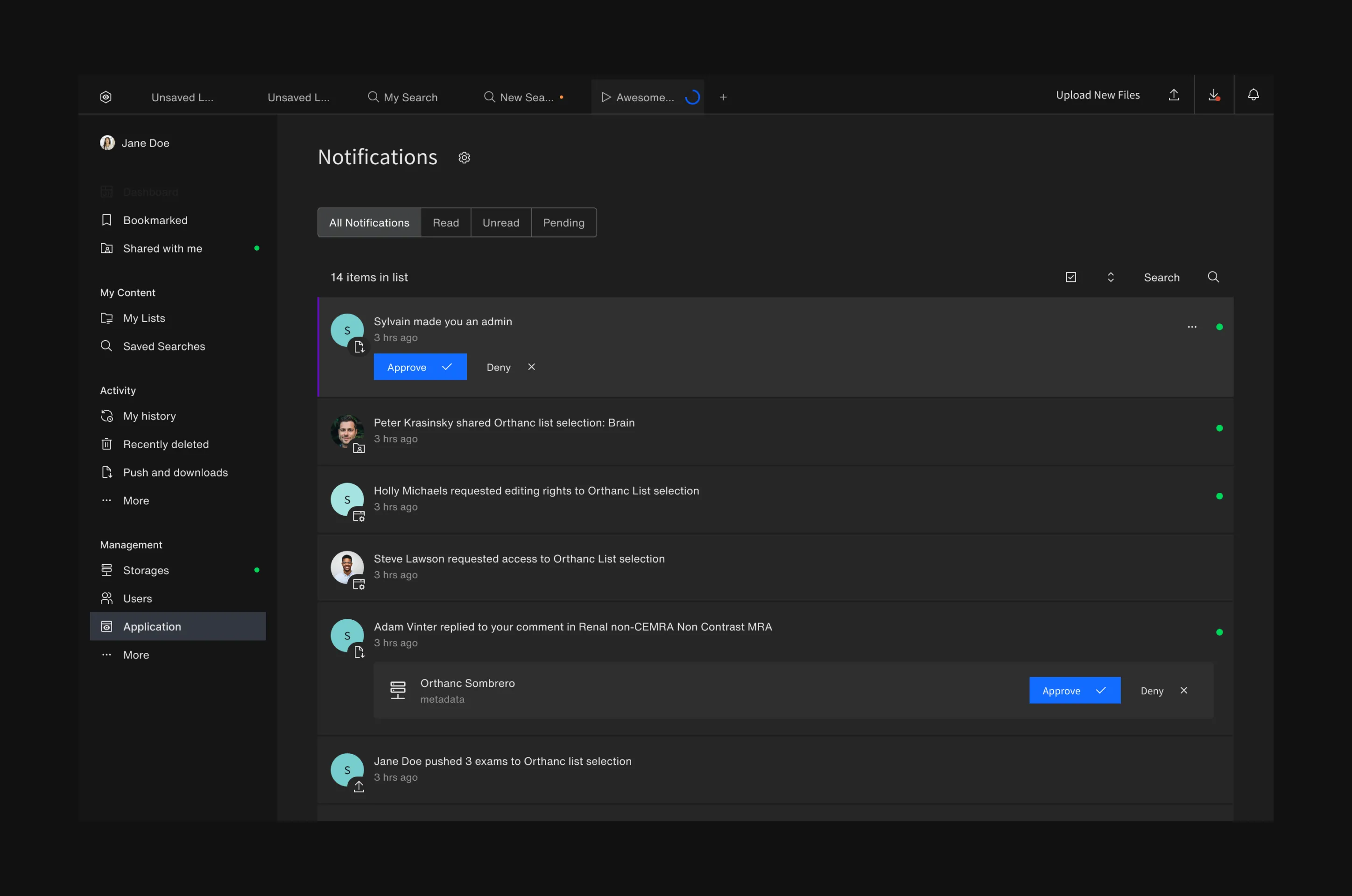
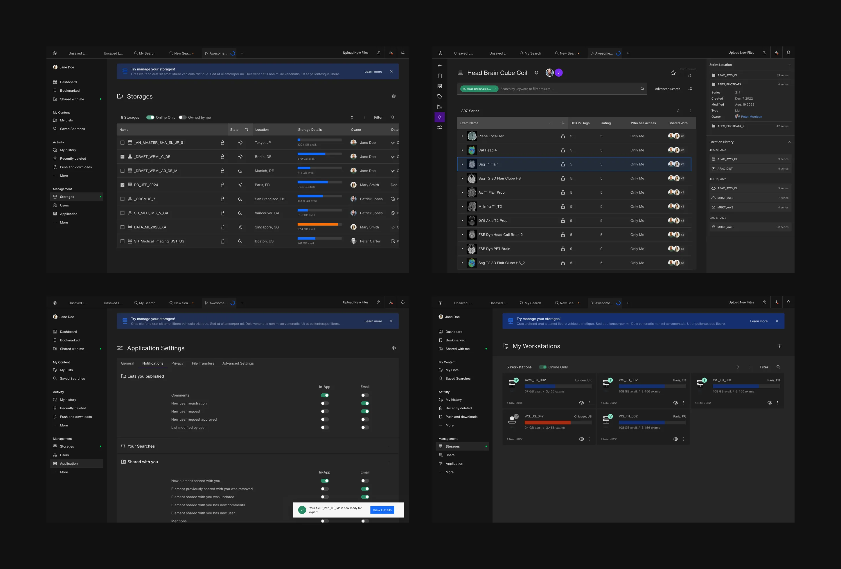
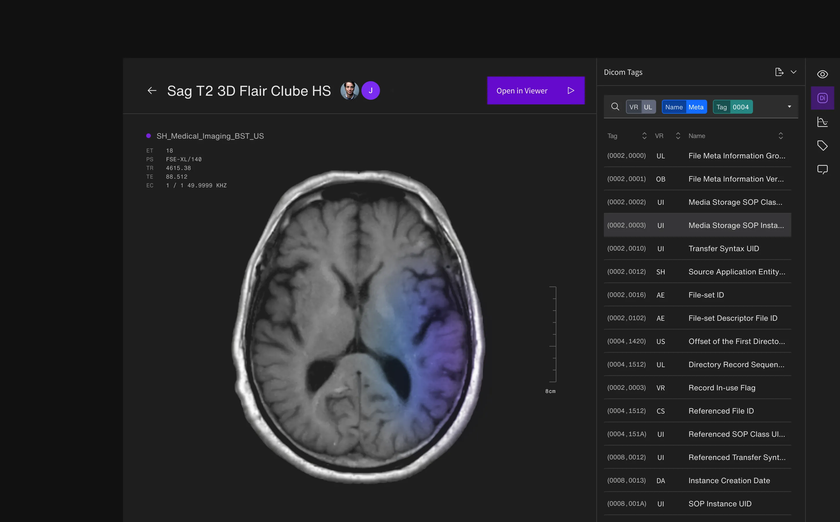
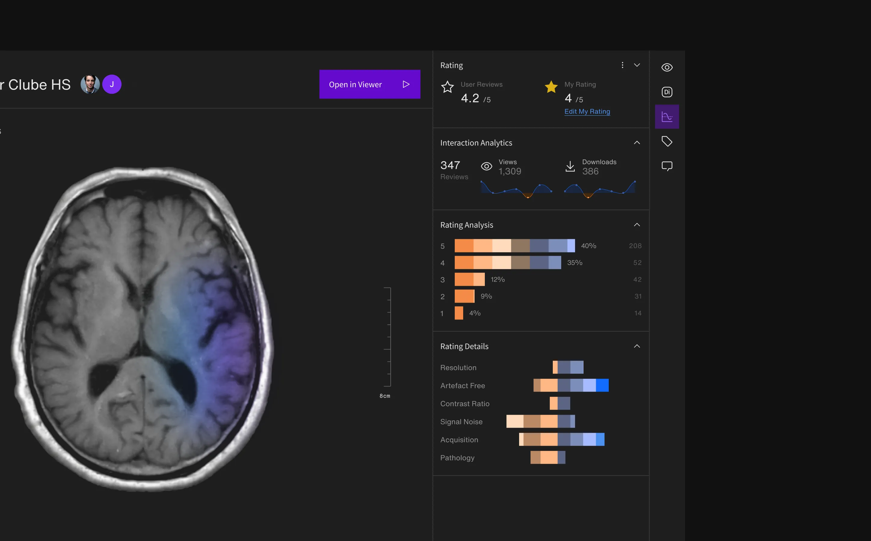
WHAT CHANGED
The 2022 audit revealed a platform that had grown beyond its original foundations. Sherlock was powerful, but its feature growth had created inconsistencies across navigation, search, lists, workspaces, forms, management screens, visual hierarchy, scaling, and component behaviour.
The work helped re-establish a product foundation: clearer UI principles, prioritized improvement batches, a stronger design system, and a more maintainable bridge between design and front-end implementation. The most important shift was conceptual: Sherlock needed to evolve from a feature-centric tool into a user-centric product — a workspace that could support different user profiles, workflows, levels of expertise, and future platform growth.
150+
MVP screens produced
300+
components variants structured
30+
UI patterns rationalised
Up Next
All Projects